After doing research app icons and what stands out the most, it happens that the app icons that only feature the first letter or two of the app name are actually more bold and recognisable than app icons that contain the full name. Could this be because it’s simpler and easier to remember?
Due to this, we decided as a group that our app icon would contain only the first letter of Adjust.
Next is the font of the letter ‘A’. It needs to be a readable font, but also representative of our app and it’s fresh outlook to healthy lifestyles.
Let’s begin with my first draft at the app icon (the blue one). I chose the light blue colour because to me, it symbolises health and healing – which is what our app promotes!

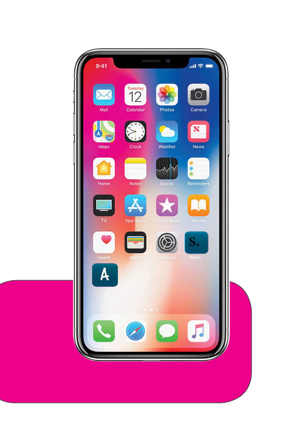
This is the app icon placed on the home screen of an iPhone. We thought it would be important to show this as it gives our group an idea as to what our app would look like on a real home screen!
Personally, we think it suits the simplistic dynamic of the phone home screen quite well and pulls off as a real app!

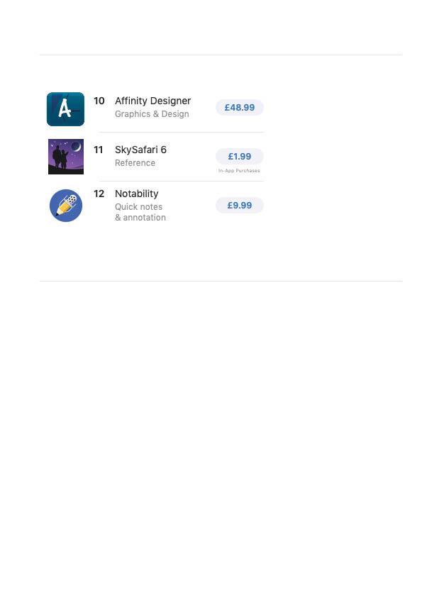
Not only did we place the drafted app icon onto a home screen, but we also placed it onto the app store; as if we were about to purchase/download the app ourselves. Ignoring the app title and the price, the app icon fits in well with the app list.
