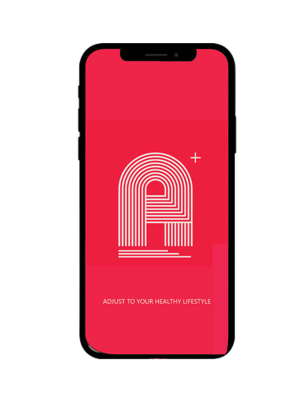
When it came to deciding upon our colours, one of our team came up with the bright idea to style and design our own shade of “Retro Red” which is what our whole logo and theme then became based around. We believe that the intricacy of the fine white lines in the logo portray paths to progression, the red background is harsh so its recogniseable – but toned down due to the deeper red we have chosen to keep our retro theme.

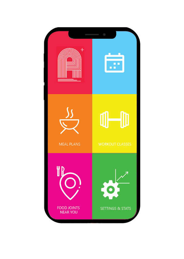
After the loading page we move on to the home screen which is personal to everyone with adjust, as will be explained in later blog posts about what we provide and how we achieve our goal and how that ensures you acheive your fitness and health goals – which is our top priority.
As you can see here we have used a block colour approach when it came to styling each icon and screen button you have a choice between – its a fun design that engages the eye and we hope gets you excited about workouts and fitness.
So guys, a quick introduction to our new interface! Short and sweet but don’t you worry, keep posted for updates on app development and an explanation on why we are so different than the rest and how we can slot perfectly into your lifestyle to create a fitter, healthier you. See you soon!
