The next step in the re-brand of Slazenger is re-designing the logo. Here’s Slazenger’s current logo:

It’s clear that the brand has chosen a very simplistic look, with only black and white as their colour scheme. Usually, the simplistic look is favoured within today’s contemporary society, as consumers enjoy a nostalgic touch to their brands. However, this approach clearly did not work with Slazenger.
Not to worry though, we’re going to create a new logo that WILL WORK!
To start us off, we need to think about a colour scheme. I reckon a light green would work well as it gives connotations of freshness, health and optimism. What a perfect bunch of words to describe our values for the re-brand!
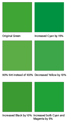
Above is a colour palette I created of several green shades, to decide which one best suits our re-brand. Out of the 6 shades, the bottom right was the winner. This is because it balances both the boldness and brightness – meaning the font will stand out and won’t blend into the lightness. Next is the font choice!
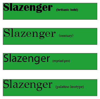
My favourite out of the 4 is the brittanic bold font; it’s boldness will catch customers eyes, without being too difficult to read.

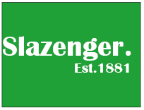
We as a collective were certain that the new logo would feature a reference to Slazenger’s heritage. We feel the brands rich history isn’t appreciated enough so we wanted the re-brand to focus on where the brand all began! Since Slazenger began in 1881, we thought it would be a good idea to incorporate ‘Est 1881’ into the logo!
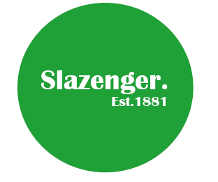
Personally, I think the sphere is more eye-catching and modern than the rectangle. The rectangle is more standard and boring – which will definitely not attract the customers!!!
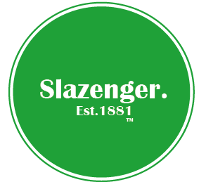
Above is my final re-design. I moved the ‘Est. 1881’ central, as it shapes ‘Slazenger’ better. I also added a little ‘TM’ underneath the typography, so we’re following the branding laws and guidelines. Finally, I added an outlining to the sphere. On InDesign, this is called a stroke, which I altered to ‘thin-thin’ on 20pt with green fill. I feel like this gives the logo a little extra touch of elegance.
That’s it for now guys, you’ll have to wait until the next post to see what our second re-design is!
