After choosing from the 2 potential new logos, we picked this one!
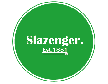
We feel this design suits the values of Slazenger that we’re trying to reinforce more. The fresh green and white colour palette gives connotations of an innovative brand that is modernising their content, to keep up with the high demands of sports fashion. The shape of the sphere also creates the vision of a tennis ball – which is a significant feature of the heritage focus of our re-brand. We want to bring attention to Slazenger’s heritage and promote the longest sporting sponsorship with Wimbledon and their tennis balls.
Whereas, whilst the other logo was heavily heritage focused with the black and gold, it didn’t really scream a sports brand. It’s important that within this re-branding process, we evenly balance out the emphasis on Slazenger’s heritage and it’s sportsmanship prestige as a brand.
However, we didn’t stop there. After deciding on the first redesign, we looked into what we could improve. Since we’re reinforcing the heritage aspect of the re-brand, we decided to underline the ‘Est. 1881’ just to show the significance of it’s history!
We hope you all like it as much as we do!
