Featured

Researching into how companies brand themselves!

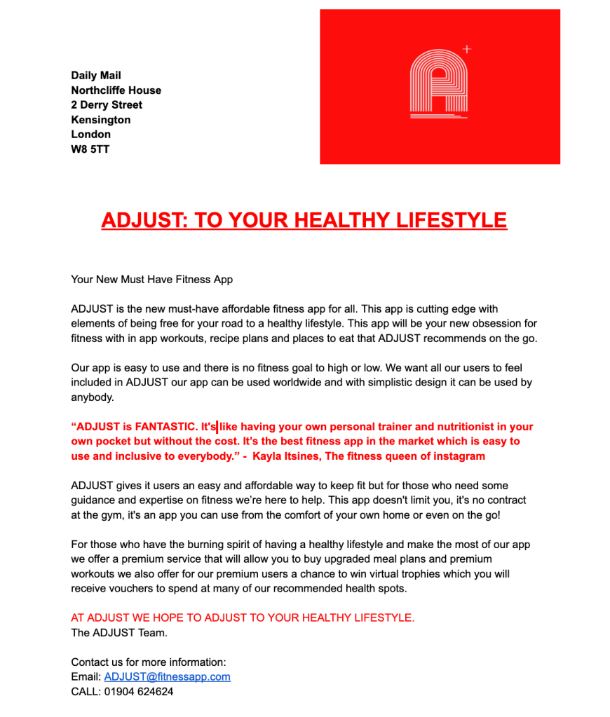
Hey guys, today we’ll be discussing our findings from our branding research. It’s very important that before we brand our company, as well as branding our app; the branding of Synergy Media will also represent our team to the market. Our previous blog post announced our company name of Synergy Media and explains our reasoning behind this.

‘A brand name should not only appeal to the customers, it should have other desirable properties, depending on the nature of the market’.

Some of those desirable properties include a relevance to the product, memorability, connotations associated with the brand name and a distinctive image over competing products.

Multinational conglomerates will use branding companies to present themselves with all of the desired properties listed above – as a brand creates ownership and must be perceived legitimately by the market.

We decided to look into 3 branding company website and analyse how they all display themselves to customers…

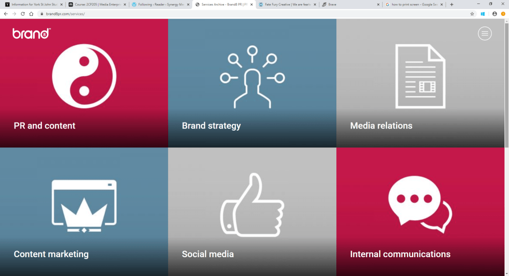
The first one we looked into was called ‘Brand8’. https://brand8pr.com/

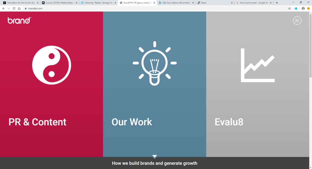
Straight away, we could pinpoint that this company presents themselves as very simplistic, clear, organised and easy to navigate. This would be the branding company to hit up if you wanted the job done quickly! However, the social media platforms were not as easy to find as expected. The Twitter and LinkedIn icons were not as accessible as I imagined, which could imply that they haven’t utilised social media to the simple extent that they could have. All in all though, a very straight forward branding company, that uses it’s simplicity as a form of professionalism.

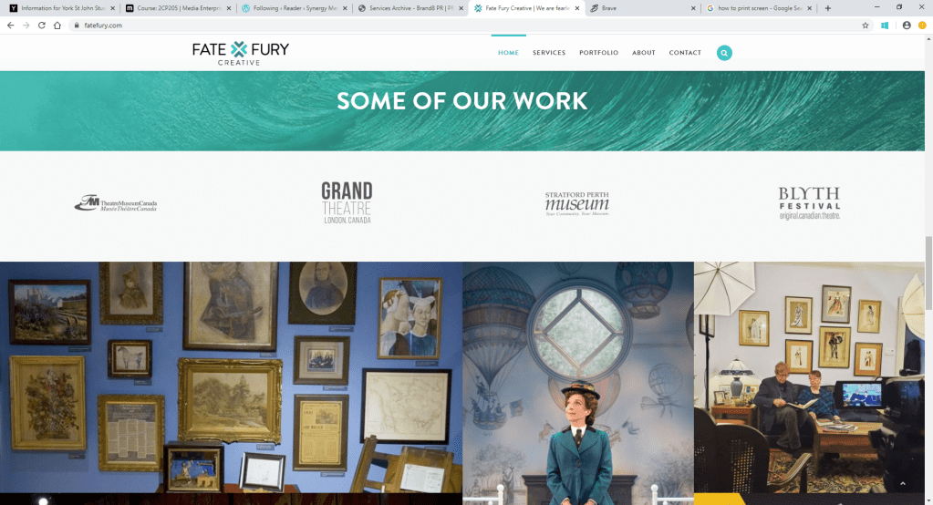
Next up, we have ‘Fate Fury’. Here’s the link: https://fatefury.com/

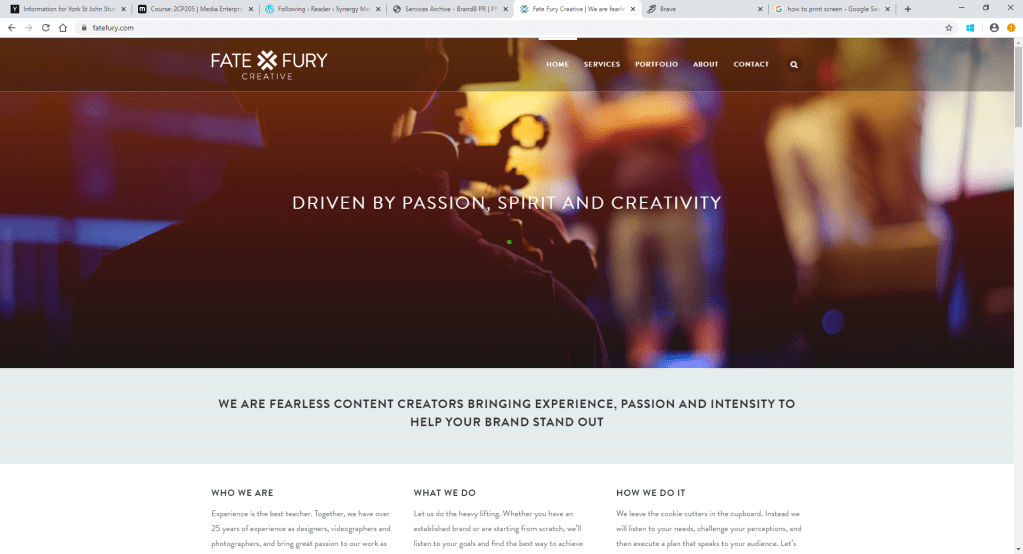
As soon as we accessed the website, it wasn’t as obvious as to what the company was about. It was only until we read into the description that we learned, which suggests that Fate Fury isn’t as noticeable as Brand8 was. This could be implying that this company takes their approach to business more privately, rather than commercially. In terms of social media though, Fate Fury links every platform: Facebook, YouTube, Instagram and Twitter. Could this be implying that they need more social media platforms because they aren’t as well known within the branding industry? This does demonstrate an effective utilisation of social media. Out of all 3 branding companies, this is probably our least favourite as it doesn’t scream out ‘branding company’ until you read into yourself.

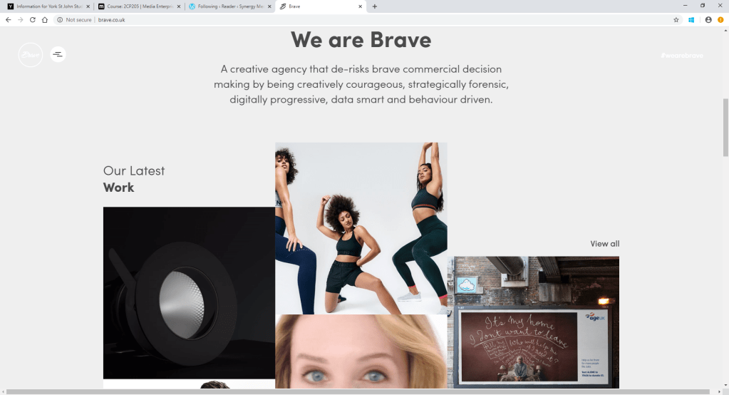
Finally, we have ‘Brave’: http://www.brave.co.uk/

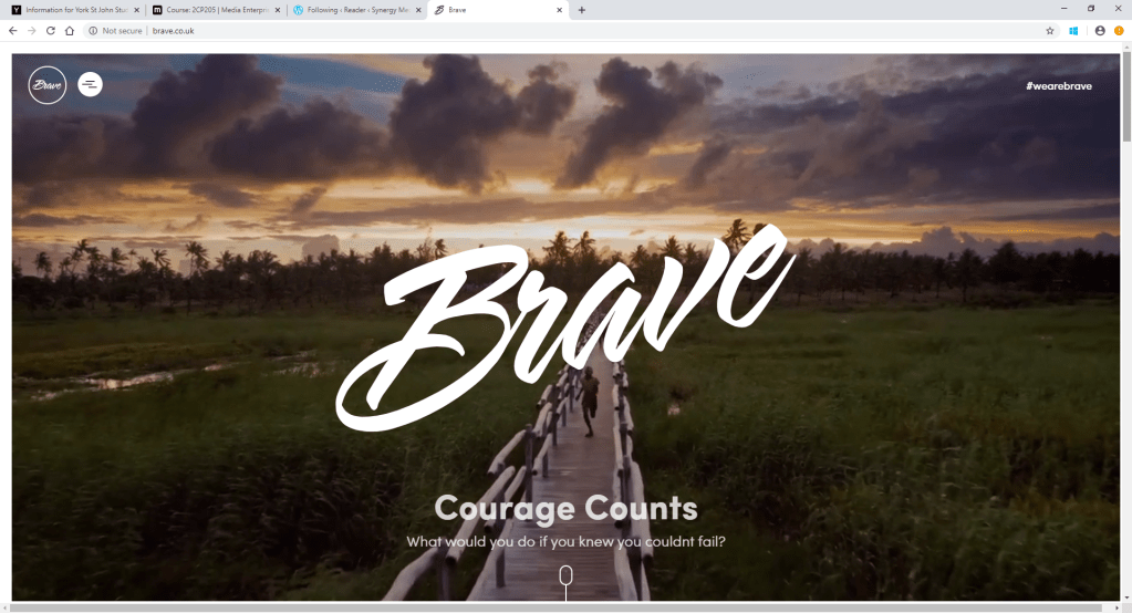
Brave clearly presents themselves an as interactive, animated branding company from the first look at the website. the first thing we see as customers is a promotional video which features multiple celebrity endorsements in it – such as Rio Ferdinand and Eyal Booker! This not only catches the eye of the market, but straight away demonstrates the companies skills and what the work that they have to offer us. Also, in the corner of the promo video, is the hashtag #wearebrave. the hashtag is alluding to the likes of Twitter, Instagram and Facebook that all use this is an advertisement. When scrolling down, Twitter, Instagram and LinkedIn are all inserted into the website, which shows that they have utilised social media through multiple ways on their website. This is definitely our favourite out of the 3, as it caught out attention the quickest, demonstrates strong branding skills through a portfolio and makes the business itself very clear.

From researching these 3 branding companies, we have learned that our market needs to be able to recognise what our product is straight away and is therefore represented clearly.

Social Media Re-vamp for Slazenger!

When first researching into Slazenger as a brand, what stood out to us was their abysmal social media presence. It’s clearly evident that the brand do not keep up with the high demand of customers, because if they did, we would see a consistence, exciting social media presence.

At the end of the day, a brands success will obviously depend on it’s quality – but the brands will struggle to be recognised without advertisement. Whilst print media is still very common and powerful, we have entered a new era, in which social media dominates advertisement.

Two of the most prominent social media apps for advertisement are Twitter and Instagram – so what does Slazenger’s Twitter and Instagram look like?

As you can see from above, the Slazenger logo’s for both social media’s don’t even match! How are users supposed to know whether the accounts are legitimate when there’s no consistency? The twitter header is very crowded and hard to read because there’s so much writing – this isn’t going to attract users as they will be put off by all the reading and therefore won’t read it. The last tweet was nearly two years ago, which shows how little social media presence they have.

TIME TO CHANGE THIS!

Slazenger’s new Twitter represents the contemporary era that the brand are entering. With the simple and bold header, we’re reinforcing Slazenger’s focus on their heritage, whilst not giving the users too much to read on the screen. The photo tweet shows celebrity endorsement; due to Slazenger partnership with Serena Williams. This will attract sports fans attention to the brand – who will more likely buy the goods, if they know Serena Williams wears and uses it. The short bio ‘Since 1881’ proves the accounts legitimacy, as the slogan is being repeated on all social medias.

Above is the re-vamped Slazenger Instagram page. The logo matches the Twitter logo, which makes it easily recognisable for social media users and shows that it’s the legitimate account. The bio is short and simple, featuring the hashtag ‘#Est1881’ which will accentuate Slazenger’s global village and will attract more interest into the brand. The second row of posts follows a theme and promotes the concept of Athleisure – which we want to draw focus on for the re-brand.

There we go, the social media revamp for Slazenger. This will play a massive role in attracting customers and will catalyse the success for the re-brand!!

Slazenger Advertisement Analysis

Hey guys, as you can see from the advertisement proposal, we really liked Spotify’s way of advertisement and wanted to use it as inspiration for our own advertising!

The simplicity, humour and consistency were the 3 main factors that we took from Spotify and want to follow. Let’s see if you think we followed this!

These play on word phrases not only link to the Slazenger’s heritage, but also joke about Tennis and feature Andy Murray. The history, sports and celebrity endorsement is a big reinforcement throughout the re-branding and the print advertisements display this.

Despite the take-over of social media, Billboards are still a significant form of print advertisement that remains successful all around the globe. This is because Billboards are very flexible and can be placed anywhere: on the sides of buses, bus stops, cities, on the side of popular roads. This makes billboards very accessible to pedestrians, drivers, cyclists etc and therefore is a very smart from of advertisement to attract a re-brand.

All billboards are themed with Slazenger’s colour palette, which makes the adverts easy to recognise and let customers begin to assign the green and white colour palette to Slazenger. This begins to bring back Slazenger’s identity and makes the brand unique again – which was a key aim for the re brand. All advertisements also feature the Slazenger logo and the typography; this consistency is key for the advertising revamp, as it promotes the innovation Slazenger has gone through and will make sportswear and equipment consumers trust the brand more. Especially the celebrity endorsement of Andy Murray will attract his fans and will enlarge the fan base of Slazenger.

What does everyone think? As a group we feel that these advertisements fit the aims and values of Slazenger perfectly. Now, we want to continue this theme onto the social media re-vamp; you’ll have to wait until the next post to see if we achieve this!

Marketing & PR: PEPSI

Pepsi has had many successful campaigns but also have had some very unsuccessful campaigns but as a worldwide company they soon fix those issues. Without to much damage to their reputation.

In 2019 they launched their first new global brand platform in seven years. Pepsi launched with a new global platform with the stapline “For the love of it.” Replacing its old one “Live for the now” which had been the case since 2012.

With the slogan it included a new can design, with out-of-home and video advertising focusing on the “pop and fizz” of the drink. 

Roberto Rios, senior vice-president, marketing, global beverage group at PepsiCo, said: “We are confidently celebrating who we are – an iconic brand rooted in entertainment with a refreshing and delicious beverage people around the world love – as well as who our fellow cola lovers are.

“‘For the love of it’ is our rallying cry, proudly saying to go all in for the things you love – from passions and interests like football and music to unabashedly enjoying one of life’s favorite treats – Pepsi.”

So from this campaign for our app we have decided you can promote other activities but to always refer to the product like pepsi has you can love your interests but always refer to your product. It plays on the nostalgia element to which is good.

Marketing & PR: Dove

Dove (owned by unilever) has had many advertising campaigns over the years with many being successful. One of the main campaigns which started in 2004 it celebrates natural beauty due to the fact dove is known as a gentle and kind skin products. The campaign is called “Celebrating beauty diversity.”

  • Having their ads on many media channels such as TV, social media and using the hashtag real beauty can create help the campaign be successful by sharing on social media. They do this by installing there core values by promoting body confidence and showing being natural is core to their brand.
  • From this for our app we decided we wanted to promote diversity and to show our consumers we care about growth and care for our users.

THE FINAL RE-DESIGN LOGO!

After choosing from the 2 potential new logos, we picked this one!

We feel this design suits the values of Slazenger that we’re trying to reinforce more. The fresh green and white colour palette gives connotations of an innovative brand that is modernising their content, to keep up with the high demands of sports fashion. The shape of the sphere also creates the vision of a tennis ball – which is a significant feature of the heritage focus of our re-brand. We want to bring attention to Slazenger’s heritage and promote the longest sporting sponsorship with Wimbledon and their tennis balls.

Whereas, whilst the other logo was heavily heritage focused with the black and gold, it didn’t really scream a sports brand. It’s important that within this re-branding process, we evenly balance out the emphasis on Slazenger’s heritage and it’s sportsmanship prestige as a brand.

However, we didn’t stop there. After deciding on the first redesign, we looked into what we could improve. Since we’re reinforcing the heritage aspect of the re-brand, we decided to underline the ‘Est. 1881’ just to show the significance of it’s history!

We hope you all like it as much as we do!

Re-designing Slazenger’s logo #1

The next step in the re-brand of Slazenger is re-designing the logo. Here’s Slazenger’s current logo:

Image result for Slazenger Logo

It’s clear that the brand has chosen a very simplistic look, with only black and white as their colour scheme. Usually, the simplistic look is favoured within today’s contemporary society, as consumers enjoy a nostalgic touch to their brands. However, this approach clearly did not work with Slazenger.

Not to worry though, we’re going to create a new logo that WILL WORK!

To start us off, we need to think about a colour scheme. I reckon a light green would work well as it gives connotations of freshness, health and optimism. What a perfect bunch of words to describe our values for the re-brand!

Above is a colour palette I created of several green shades, to decide which one best suits our re-brand. Out of the 6 shades, the bottom right was the winner. This is because it balances both the boldness and brightness – meaning the font will stand out and won’t blend into the lightness. Next is the font choice!

My favourite out of the 4 is the brittanic bold font; it’s boldness will catch customers eyes, without being too difficult to read.

We as a collective were certain that the new logo would feature a reference to Slazenger’s heritage. We feel the brands rich history isn’t appreciated enough so we wanted the re-brand to focus on where the brand all began! Since Slazenger began in 1881, we thought it would be a good idea to incorporate ‘Est 1881’ into the logo!

RECTANGLE?
SPHERE?

Personally, I think the sphere is more eye-catching and modern than the rectangle. The rectangle is more standard and boring – which will definitely not attract the customers!!!

Above is my final re-design. I moved the ‘Est. 1881’ central, as it shapes ‘Slazenger’ better. I also added a little ‘TM’ underneath the typography, so we’re following the branding laws and guidelines. Finally, I added an outlining to the sphere. On InDesign, this is called a stroke, which I altered to ‘thin-thin’ on 20pt with green fill. I feel like this gives the logo a little extra touch of elegance.

That’s it for now guys, you’ll have to wait until the next post to see what our second re-design is!

A SWOT Analysis on Slazenger

Like I stated in the previous re-branding blog post, it’s crucial to outline the weaknesses of Slazenger before we actually re-brand it. This is exactly what the SWOT analysis provides, except it isn’t as pessimistic as JUST outlining the weaknesses. It also provides the strengths, opportunities and threats of the brand!

Here is our SWOT analysis for Slazenger:

STRENGTHS
-specialises in tennis, golf and cricket-longest running sporting sponsorship in history
-was the first tennis ball supplier for Wimbledon in 1902. 
-strong range of sports accessories such as tennis rackets and balls etc
-reasonably priced-stores in 23 countries
OPPORTUNITIES
-more sponsorship opportunities with other sports
-more countries to open up stores-enhance social media platforms and gain more social attention 
-embracing the heritage of the brand with nearly 150 years of global presence
– engaging in more celebrity endorsements to represent the brand as prestige  
WEAKNESSES
-logo resembles the Puma logo with the similar jumping animal-shipping isn’t free-don’t have a mission statement-lacks social media platforms
-very poor customer service page and form
-no consistency within celebrity endorsements
-bought out by Sports Direct
THREATS
-competition from other sports brands such as Puma, Nike and Adidas
– products are manufactured in China – the origin of CoronaVirus
-unethical manufacturing and labouring could lose customers
-other sportswear brands that are cheaper within the market e.g. Primark

As MindTools states, a SWOT analysis ‘helps you to build on what you do well, to address what you’re lacking, to minimise risks, and to take the greatest possible advantage of chances for success.’. We as a company can now take these factors and focus on them for the re-branding – in order to make Slazenger the best that it can be!

Reference: SWOT Analysis: How to develop a strategy for success. MindTools. Accessed March 3, 2020. https://www.mindtools.com/pages/article/newTMC_05.htm

RE-BRAND: Slazenger

Not only do we have to create an app, but Synergy Media also has to re-brand a company as part of our project too.

We must pick a brand that we feel isn’t developing as well as it should be (for whatever reason that may be): the demand for the produce isn’t as high anymore, the competitors in the market are taking over etc.

We then outline why this brand isn’t as successful as it should be and focus on those elements to improve the most.

After that, we completely refurbish the brand and transform it into a company that should re-soar the market. By doing this re-branding task, it will build upon our skills to identity the weak elements of a company and will teach us it takes to be a successful brand.

For our re-brand, we have chosen the sporting company Slazenger!

Image result for Slazenger Logo

We decided to choose Slazenger for our rebrand as it is one of the starting sporting brands which initiated the worldwide craze within branding itself. The issue appears to be with this specific brand, is that the clothing sales are not peaking however its more the tennis produce, the lack of social media influence and even website style and dated look is very noticeable and it’s clear that a rebrand is needed.

The brand actually specialises in a lot more sports than consumers realise (Tennis, Golf, Swimming, Cricket, Hockey) but if we as consumers don’t realise this, then clearly there is an issue with the brand itself and not being recognisable enough? 

We also believe that whilst the company is still selling products, they haven’t really put effort into keeping up with trends and releasing products according to demand. There is no USP of We do not want this to erase the historic heritage that the brand has and therefore want to rebrand Slazenger, in order to bring back the powerful reputation it used to have within the sports industry. 

The sportswear market is competitive and it’s important that instead of sitting in the back seat of the competition, Slazenger rises and faces the markets most well-known brands such as Nike, Puma and Adidas. 

It could also be argued that Slazenger have very little social media influence, with content rarely posted and very little followers in comparison to the competitors Nike and Puma etc.

Keep following our blog to see the developments of our re-brand project!

Design a site like this with WordPress.com
Get started