Presentation #1 Feedback

As part of the media enterprise module, we were warned that in week 6 and week 11 we would present practice presentations – in order to prepare us for our final pitch at the end of the module. This is a very smart idea as the constructive criticism we receive on these presentations, allows us to make improvements – so our final pitch is the best it can possibly be!

This week (week 6) was our first presentation. Here is the link below, if you wish to view it on PowerPoint:

https://drive.google.com/file/d/1Eiidtl0estFogRuVidnFvIATs1evW-hM/view?usp=sharing

As a collective, we feel the presentation went really well. Despite a few nerves beforehand, we believe we confidently delivered our presentation and made all points we shared very clear.

In the final pitch, it is expected that every group member speaks for at least 5 minutes and therefore would mean our final pitch should take around 25 minutes to present. However, as this is week 6 we only really have around half the content that we will have for the final pitch; meaning this presentation should be around 12/15 minutes long.

In terms of timing, we nailed it with the presentation lasting 13 minutes. With each of us speaking for around 2/3 minutes, this shows that we are on the right track to the desired time for the pitch. Wooohooo!

Now onto the feedback our tutor gave us…

THE POSITIVES:

  • We all spoke very confidently and clearly
  • We we’re very knowledgeable about our project and showed that we understand what we’re performing
  • The developments of the Adjust logo show that we wanted to make it perfect!
  • The final Adjust logo and all it’s hidden meanings was favoured as it suits our app concept
  • The timing was perfect, we all spoke for long enough
  • The reasoning behind the name ‘Synergy Media’
  • The mind map of name choices for the app
  • The promising start to the app page designs so far

Things to Improve on:

  • Try not to waffle on about the reasoning behind the name ‘Synergy Media’
  • Too much writing on the slides, shouldn’t be speaking from the slides
  • Needs more pictures to show the progress instead
  • Needs a ‘what next’ slide to show that we understand what we need to work on
The Development of our App

Welcome to a taste of our app development – we hope you’re as excited as we are!

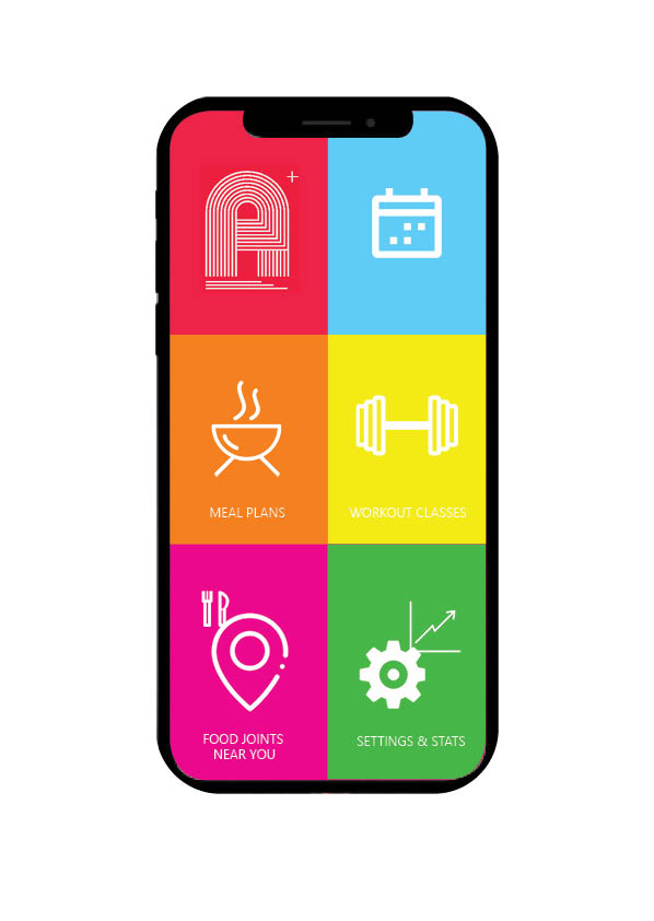
As promised, a look into the development of our app – lucky you. As seen on the interface – there are six icons, today we are looking into the “Workout Classes” segment of the app.

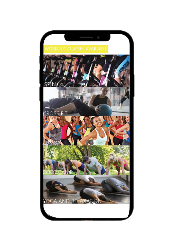
Page 1, classes available to you

Page 1 of your workout classes is shown above, we have used a bar like design to optimise screen usage and give you a taste of what is to come in our classes. All you have to do it tap the bar which you want to take/view classes in, and it’ll take you right where you need to be…

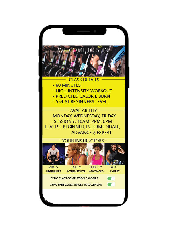
Here we have what would come up in for example you had selected an ADJUST SPIN class – in the top we can see class details, things such as time elapsed, what level you are looking at, and how many calories you are expecting to burn.

Below this shows you availability and which days the classes take place, along with what level/intensity you are after – all of which are available on each day mentioned.

Then is moves on to your instructors, beginner through expert – so you can put a face to a name. We have gone through the effort of this to create a more connective environment for your trainer and you, without the extra cost of a PT.

Most importantly at the very bottom, we have our syncing options which to make the most of ADJUST you will definitely be wanting to use. You can sync your calories and information from the class to your personal progress charts in settings ans stats, not only this but class availability can be synced to your calendar to ensure you don’t miss a trick.

We hope you enjoyed that taster into what our app is going to include and assist with, theres plenty more where that came from guys – but we are keeping the really exciting stuff under wraps for now.

Creating the home pages for ADJUST

The loading page for the our App

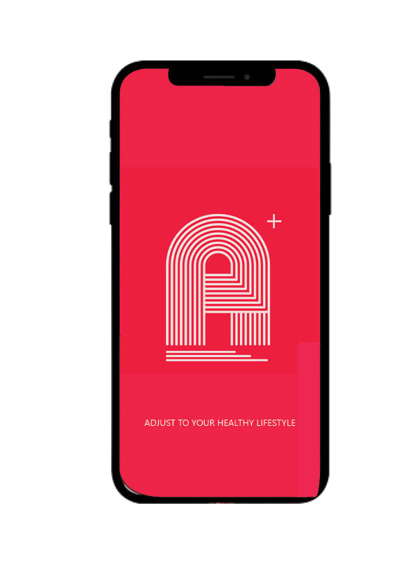
When it came to deciding upon our colours, one of our team came up with the bright idea to style and design our own shade of “Retro Red” which is what our whole logo and theme then became based around. We believe that the intricacy of the fine white lines in the logo portray paths to progression, the red background is harsh so its recogniseable – but toned down due to the deeper red we have chosen to keep our retro theme.

After the loading page we move on to the home screen which is personal to everyone with adjust, as will be explained in later blog posts about what we provide and how we achieve our goal and how that ensures you acheive your fitness and health goals – which is our top priority.

As you can see here we have used a block colour approach when it came to styling each icon and screen button you have a choice between – its a fun design that engages the eye and we hope gets you excited about workouts and fitness.

So guys, a quick introduction to our new interface! Short and sweet but don’t you worry, keep posted for updates on app development and an explanation on why we are so different than the rest and how we can slot perfectly into your lifestyle to create a fitter, healthier you. See you soon!

Habit Forming Products

From our lecture that was based around habit forming, we were set a task to analyse the Duolingo and Headspace apps and discuss how they use certain habit forming techniques that we could possibly incorporate into our app. As both apps require or encourage an everyday habitual use, we felt this was very relevant to and similar to what we want to achieve with our app.

Both apps use a variety of similar triggers, both external and internal, to encourage habitual use from their users. External triggers are essentially features that allow us to interact with the app, such as buttons. In this instance both apps we looked at featured many visually pleasing and colourful buttons that encourage users to press them, especially in the ‘introduction’ phases. For example, Duolingo has a feature that highlights new words yellow, encouraging users to press on them which rewards them with the translation as well as an audio pronunciation. Duolingo also heavily pushes users to turn on notifications, giving users frequent reminders to use the app. Nir Eyal states that the easier triggers are to identify and interact with, the more likely the user is to engage with it and form a habitual relationship. We have kept that in mind with the design of our app, using colourful triggers on the menu screen in the aim of enticing more users to form a habitual relationship with Adjust.

From our lecture we learned about Eyal’s hook model which explores the process in how habits are formed. The model basically claims that triggers lead to an action, then a reward, then investment. In order to gain investment and form a habitual relationship with the user, it is imperative that the user receives some form of reward for activating such trigger. Eyal states that there are three categories of reward, labelling them; The Tribe, The Hunt and The Self. Understanding each type of reward could prove useful in creating our app and ensuring it has habit forming features. The Tribe describes rewards based on social elements such as cooperation and competition. To achieve this type of reward in our app, users could share their meal plans with others or recommend food joints to others. The Hunt describes rewards that are based around our desire to seek and gather. Again, this reward could be achieved through activating the ‘food joints near you’ button on the menu screen. Finally, the self category of reward describes rewards that are self fulfilling or gives us self satisfaction. As our app is essentially based around self fulfillment and improving your health, there are many triggers that may achieve such form of rewards, such as the schedule button/page.

Now we have discovered how apps may form habitual relationships with their users, it is time for us to go away and consider more ways our app can do so.

PERSONA

Below we have created personas of our target audience:

Student and Part Time Worker – Charlotte Smith 18: Working at a part time job being a supermarket shelf stacker and a university student in Huddersfield. She is earning minimum wage on a zero hour contract.  She has a desire to get fit but due to commitments finds it hard to find time to work out in a gym and wants a recipe plan that fits around her lifestyle but that is affordable.  Due to being on the go she find it hard to find healthy places to eat.

Unemployed- Curtis Blackett 25-  Curtis lives in Darlington. He is unemployed. He is currently on universal credit as a source of income so he is looking for fitness app which is affordable but can access features without having to pay that much. He likes the idea of keeping himself fit while job seeking. He is looking to find recipe plans that are within his budget and can keep him in a routine while job seeking. 

At home worker and stay at home mum 35 Lydia-  Lydia lives in Belfast. She is a stay at home mum. She runs a small cupcake business on the side.  She doesn’t have time to go to the gym due to looking after her children and running her small business. She wants to work out while she has spare time and wants something that is not to be committed. Plus wants to cook healthier and low cost meals for her family.

TARGET AUDIENCE

Our first thoughts were that we wanted to create and design a fitness app aimed at students looking for an affordable way to get fit, choose fitness plans to suit them and keep track of daily intake. 

We first discussed apps similar to our idea in the fitness app market. By doing this we searched through the app store using our phones. We discovered many apps but the two that popped up the most on the android and apple store were MYFITNESS PAL and Nike training club. 

This research gave us ideas and insight into the gaps in the market for fitness apps. Concluding this research we decided that our app will target those with a low income and are looking to get fit through an app rather than a gym subscription. Plus we decided to include a map of recommended healthy places to eat which the other apps seem to miss.

In the app it will include a workout schedule, In app workouts, recipe plans, recommended near you and settings and stats.  The app will be free but with add ons which will be premium options. 

The app is a fitness app and can help you get fit at an affordable rate.

The finished Adjust logo!

As you would have seen in our last blog post, we had 2 designs to chose from.

As a collective, we decided to use the second design. This is because, as creative as the bull representation is, it may not be understood correctly by the target market and it may be perceived as a food or animal app instead of a healthy lifestyle app. Also, we favoured the simplicity of the second app and how powerful it was for Adjust as an app. 

However, we didn’t stop there. After deciding on the second app design, we discussed what could be improved to it. As much as the bold red represented our values and aims as an app, we felt that it may have been too bold and needed toning down a little. 

After playing with the hue and saturation levels on the shade, we lowered the saturation which took some of the brightness away from the red and toned it down. Also, we realised that in comparison to the rest of the logo, the scale of the ‘A’ was actually quite small; therefore we enlarged it.

The next question is – will it work realistically?

The only way to find out was to place the app icon in realistic places…

Above you can see the Adjust icon in the app store^^

Above is the icon on the home screen of an iPhone – fits in well, doesn’t it?

Adjust app icon development…

Following on from our previous adjust app icon ideas, we’ve been busy creating some more!

The first design incorporates a bull, which insinuates energy and strength. The purpose of the bull is to represent the courage that customers will gain from changing their lifestyle.

The first design however features 7 ‘A’s in total, to represent that our app may change your lifestyle in more than one way. With all of the ‘A’s positioned differently (some upside down), this implies the variety of ways Adjust may impact the customers lifestyle. 

After researching app logos, we noticed the dominant use of bold backgrounds – as a way to catch the customers eye and remind them of the app on their home screen. This explains the yellow, which connotes the energy that customers are meant to feel from using the app. With such a bold background colour, means that the font colour should be kept basic to make sure the colours don’t clash – hence the black typography.

The colour red also represents health, which is perfect for our app concept.

The typography was created ourselves via InDesign, with 3 white lines to define the font. Rather than a block font, this font suggests that you don’t have to follow the standards and that you can be unique – just like the customers of Adjust are by adapting their own unique lifestyle. Thewhite typography was based on a simple colour that wouldn’t clash with the boldness of the red, just like in the other app logo design. 

The underlining of the letter, with the white lines expanding more each time, is a representation of the growth that customers will achieve from using Adjust. 

Finally, the plus sign in the top right corner of the logo is to reinforce that Adjust gives you more than just a normal fitness app, and that using the app will provide you with maximum support on your lifestyle.

How the professional masterclass helped us with ADJUST

In week 5 we had a professional masterclass with Matt Higgins of iProspect, a digital marketing agency which pairs purchases together.

“The digital economy has fundamentally changed how we buy. Relationships between people and brands are increasingly transparent. Shoppers have unprecedented access to information and choices. Brands have more in-depth understanding of consumers’ intentions. And all of this powered by an increasingly connected mobile and digital media environment.”

This masterclass taught us to not underestimate the use and reading of data, as this is where we can see how to become successful and profitable in the longrun of our app.

Another thing we learned, was the importance of collaboration and teamwork – after this day our app really started taking shape, we all had our set tasks and we each discussed and helped one another in decision making in the best interest of ADJUST.

Matt really helped us in understanding our brief, thinking about the goals/outcomes of our brief, the audience (that’s you guys!), and planning on how to get there and make it all work collusively.

Core Values

Similarly to the mission statement, a business’ core values provide stakeholders with more insight into that particular business. However, the core values are usually more in depth and concerned more about the ideologies and beliefs of the business rather than giving a broad idea of what they aim to achieve. So with this in mind we came up with the following core values that we deemed suitable for Adjust:

‘Shaping a more active, progressive and inclusive society.’

‘Developing the present to strive for a greater and more dynamic future’

‘Providing the tools and support for a superior lifestyle’

‘Encouraging a nostalgic warmth into modern day routine’

We felt that these core values positively represented our app/business and what it involves and stands for. The first core value is a slight reference to the low cost and target market/audience for our app. The second and third core values focus more on what our app involves and is about (a healthier future). The fourth and final core value is a slight nod to the nostalgic retro theme and design of the app itself whilst incorporating a relevant positive message.

Design a site like this with WordPress.com
Get started