Mission Statement

Upon doing some research into existing businesses mission statements, we found that most were relatively broad and brief whilst giving a good indication of what that business stands for and perhaps even how they operate. For example, Starbucks’ mission statement is, ‘To inspire and nurture the human spirit – one person, one cup and one neighbourhood at a time’. From this statement anyone can construct a vague understanding of what Starbucks do and what they believe in without even knowing anything about the business. However, businesses such as Nike prove that a mission statement can even be much more broad than this. Their mission statement is, ‘do everything possible to expand human potential.’ While this does not exactly tell us much about Nike and how they operate, it gives an indication of their ideologies and could possibly be a nod to how diverse and large their product range is.
With this in mind, we deemed it best to create multiple mission statements and then decide on the most suitable out of the lot. Some possible ideas we came up with included:

‘To inspire and support a healthy body and mind for the masses.’

‘To achieve the best version of yourself one day at a time.’

We evaluated both mission statements and whilst we thought they were not bad, it could have been better. For instance, we thought the ‘for the masses’ part of the first mission statement disconnected us from our consumers/customers and was a little too unspecific. Whereas the second mission statement suited our idea of ‘adjusting’ to a healthy lifestyle, we thought that it did not really express our businesses ideologies or beliefs at all and was somewhat too systematic for a mission statement. Therefore, for our mission statement we decided to go with our third idea of:

‘To provide the freedom that comes from a healthy body and soul.’

We deemed this mission statement to be a perfect middle ground of being able to be open for interpretation whilst presenting a glimpse of what Adjust is about and its ideologies.
Adjust Logo Ideas

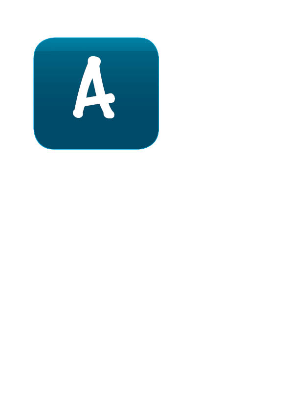
After doing research app icons and what stands out the most, it happens that the app icons that only feature the first letter or two of the app name are actually more bold and recognisable than app icons that contain the full name. Could this be because it’s simpler and easier to remember?

Due to this, we decided as a group that our app icon would contain only the first letter of Adjust.

Next is the font of the letter ‘A’. It needs to be a readable font, but also representative of our app and it’s fresh outlook to healthy lifestyles.

Let’s begin with my first draft at the app icon (the blue one). I chose the light blue colour because to me, it symbolises health and healing – which is what our app promotes!

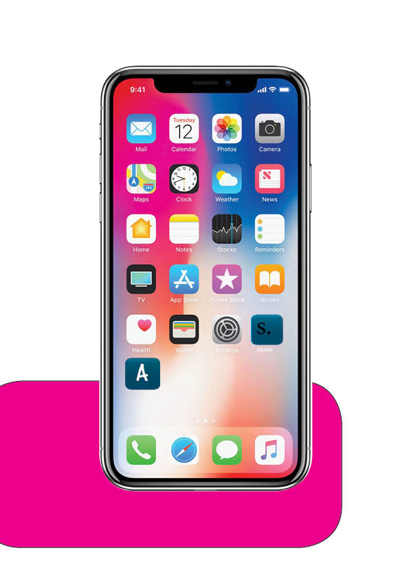
This is the app icon placed on the home screen of an iPhone. We thought it would be important to show this as it gives our group an idea as to what our app would look like on a real home screen!

Personally, we think it suits the simplistic dynamic of the phone home screen quite well and pulls off as a real app!

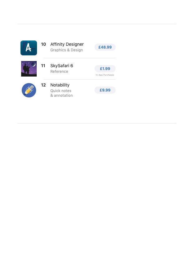
Not only did we place the drafted app icon onto a home screen, but we also placed it onto the app store; as if we were about to purchase/download the app ourselves. Ignoring the app title and the price, the app icon fits in well with the app list.

Logos

This week, we discussed what it takes to produce a SOLID logo. When we say solid, we’re referring to Andrew Shea’s 3 necessary traits to a logo:

  1. it must be distinct
  2. must be legible at all sizes
  3. it should be instantly recognisable

Not only do we have our app logo to create, but also our company Synergy Media logo to design too! It’s extremely important that both the logos we create stand out, whilst also looking professional; as we must present our company and app with formality. This will require a lot of thought into how we balance a design that’s vibrant and unique, with the professionalism as well.

Mirzoeff dives into the idea of postmodern capitalism and how corporate logos are formed. We don’t realise how many logos we are surrounded by and recognise every day; the second we see an ‘M’ formed by 2 fries, we know exactly what it is! These multinational corporations such as McDonald’s have almost dominated global business and have left us with this postmodern capitalism that Mirzoeff labels.

However, WE are in fact the biggest contributors to this capitalistic society as we become attached to the logos and feed the brands the consumerism they want.

There are 3 main types of logos, all with self explanatory names really…

  1. The Wordmark logo

Image result for amazon logo

2. The pictorial logo

Image result for twitter logo

3. The abstract iconography logo

Image result for mtv

But what type of logo will we opt for? Find out in the next blog post!!

ADJUST

It’s time that we reveal our chosen app name – Adjust!

We have decided to create a fitness and health app, this is an agenda that we believe is highly trending right now and will benefit people that want to live a healthier lifestyle, without needing the large amount of funds for it!

Our app will include diet plans, nutritional information, workout videos and daily tips on how to live your healthiest life, and much more..

Not only this, but the meaning of ‘Adjust’ is also what our app will be providing – as it will be adjusting the audiences health and lifestyle.

That’s all for now guys, thank you!

Researching into how companies brand themselves!

Hey guys, today we’ll be discussing our findings from our branding research. It’s very important that before we brand our company, as well as branding our app; the branding of Synergy Media will also represent our team to the market. Our previous blog post announced our company name of Synergy Media and explains our reasoning behind this.

‘A brand name should not only appeal to the customers, it should have other desirable properties, depending on the nature of the market’.

Some of those desirable properties include a relevance to the product, memorability, connotations associated with the brand name and a distinctive image over competing products.

Multinational conglomerates will use branding companies to present themselves with all of the desired properties listed above – as a brand creates ownership and must be perceived legitimately by the market.

We decided to look into 3 branding company website and analyse how they all display themselves to customers…

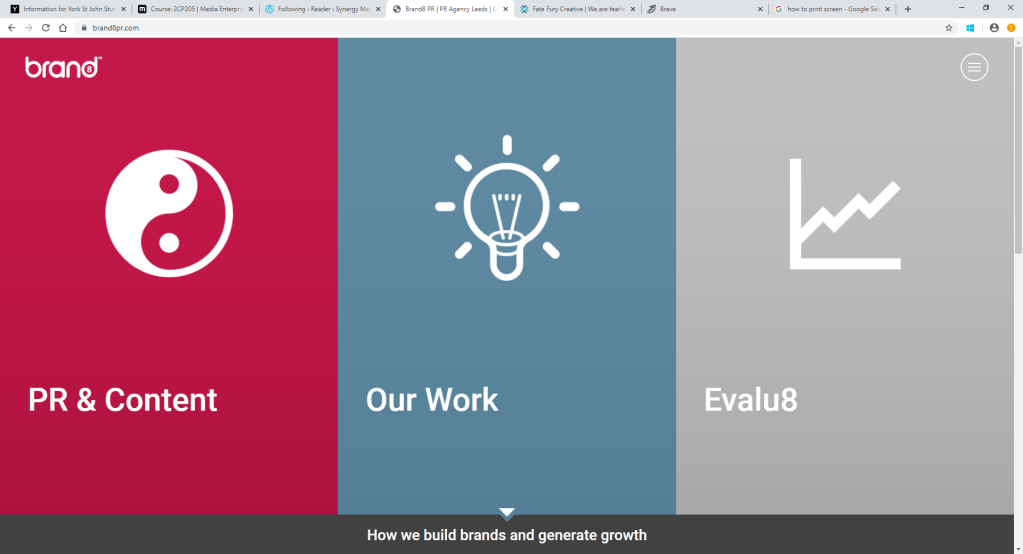
The first one we looked into was called ‘Brand8’. https://brand8pr.com/

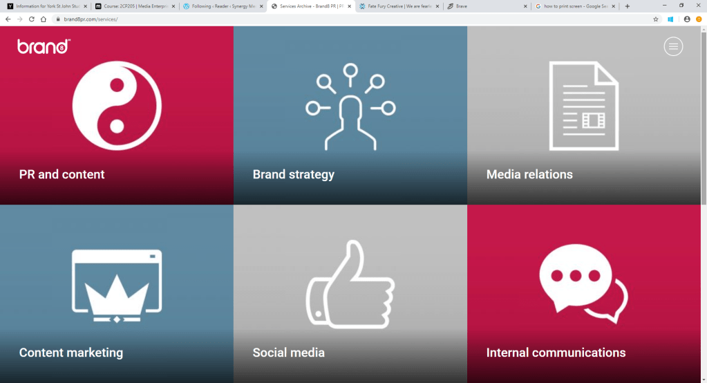
Straight away, we could pinpoint that this company presents themselves as very simplistic, clear, organised and easy to navigate. This would be the branding company to hit up if you wanted the job done quickly! However, the social media platforms were not as easy to find as expected. The Twitter and LinkedIn icons were not as accessible as I imagined, which could imply that they haven’t utilised social media to the simple extent that they could have. All in all though, a very straight forward branding company, that uses it’s simplicity as a form of professionalism.

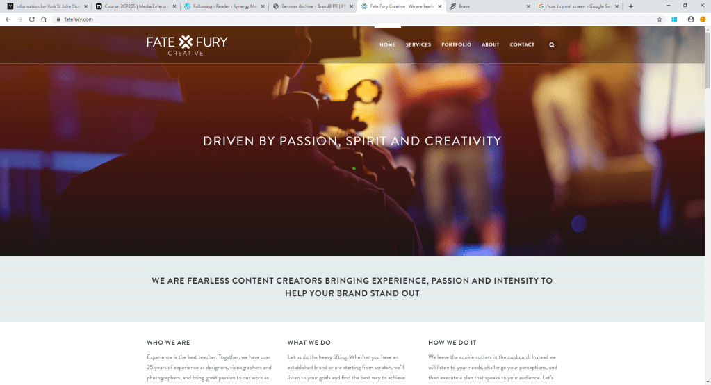
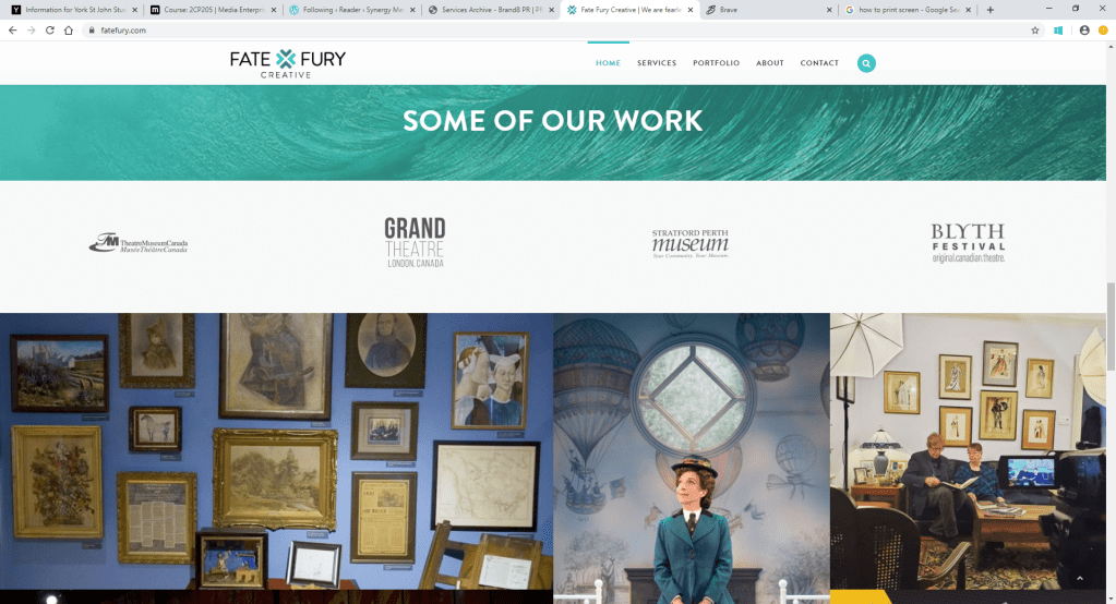
Next up, we have ‘Fate Fury’. Here’s the link: https://fatefury.com/

As soon as we accessed the website, it wasn’t as obvious as to what the company was about. It was only until we read into the description that we learned, which suggests that Fate Fury isn’t as noticeable as Brand8 was. This could be implying that this company takes their approach to business more privately, rather than commercially. In terms of social media though, Fate Fury links every platform: Facebook, YouTube, Instagram and Twitter. Could this be implying that they need more social media platforms because they aren’t as well known within the branding industry? This does demonstrate an effective utilisation of social media. Out of all 3 branding companies, this is probably our least favourite as it doesn’t scream out ‘branding company’ until you read into yourself.

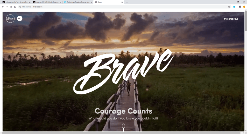
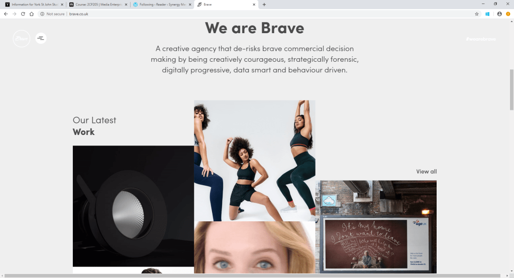
Finally, we have ‘Brave’: http://www.brave.co.uk/

Brave clearly presents themselves an as interactive, animated branding company from the first look at the website. the first thing we see as customers is a promotional video which features multiple celebrity endorsements in it – such as Rio Ferdinand and Eyal Booker! This not only catches the eye of the market, but straight away demonstrates the companies skills and what the work that they have to offer us. Also, in the corner of the promo video, is the hashtag #wearebrave. the hashtag is alluding to the likes of Twitter, Instagram and Facebook that all use this is an advertisement. When scrolling down, Twitter, Instagram and LinkedIn are all inserted into the website, which shows that they have utilised social media through multiple ways on their website. This is definitely our favourite out of the 3, as it caught out attention the quickest, demonstrates strong branding skills through a portfolio and makes the business itself very clear.

From researching these 3 branding companies, we have learned that our market needs to be able to recognise what our product is straight away and is therefore represented clearly.

Looking at Existing apps in the Market

We decided to look at two fitness apps on the apps store to see why they are doing good but look at what their downfall is so then we can build on that and make our app unbeatable on the app store.

The two app we decided as team to look at was MYFITNESSPAL and Nike Training Club. Both fantastic apps who top competitors on the app store.

MYFITNESSPAL: We found in our research that is was founded in 2003 in 2015 they had 80 million users the app is free but you can upgrade to a premium subscription at an extra cost.

Target Market:

The Fitness community and those who seek to track fitness goals.

PROS & CONS: We found out that it was easy to log food and meals due to the enormous database of food and drinks. Works well on fitness tracking devices it also has a simple design but we did find some downsides to the app including unimaginative push notifications but it does require you to be quite constant using the app for accurate readings.

What we took from this as a team is our app will have imaginative push notifications as our app is about the get up and go we want to aspire even though notifications.

Nike Training Club APP: We found in our research that the app is free it helps you reach your fitness goals with workouts expertly designed. The training is designed so you an do it anywhere from at home to the gym and on the road. It is designed for anyone at all fitness levels. The idea of this app that it customisable and that it is community fitness app to.

Target Market:  Anyone who wants to engage in fitness at any level.

PROS & CONS: The pros of the app is that it has a totally sleek interface, it has various programs for workouts with or without equipment, it has videos for every exercise with warm up and cool down in every workout. When looking at the app the issues include you have to check off each exercise once completed which you have to get up and check it off before moving on to the next exercise which could be an issue as there is no continuous flow.

What we have took from this is to have a sleek interface to connect our users but not only that to have a certain flow to exercise so there is no disruptions to a workout we want to keep our users going.

Week 1

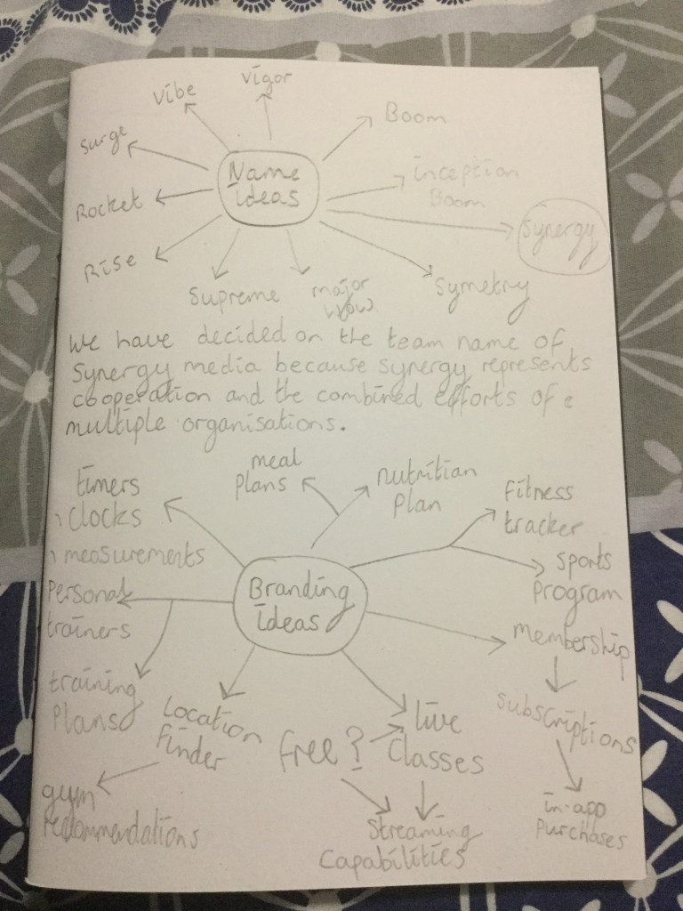
After receiving the brief this week we have decided on the company name of synergy media as this represents the cooperation of our group moving forward into this project and the combined efforts we will display when working with other groups during this project.

Represented below are the collated ideas for the group name we decided upon and the process of brain storming ideas for the product which we have decided will be sports based. We will be focusing on maintaining fitness and encompassing a variety of options and extras such as meal plans, nutritional information and a wide range of fitness programmes and classes.

These ideas are all still in development of course and will be narrowing down and refining these ideas over the coming week during our team meetings whilst welcoming any other ideas or suggestions from other groups and tutors.

Design a site like this with WordPress.com
Get started